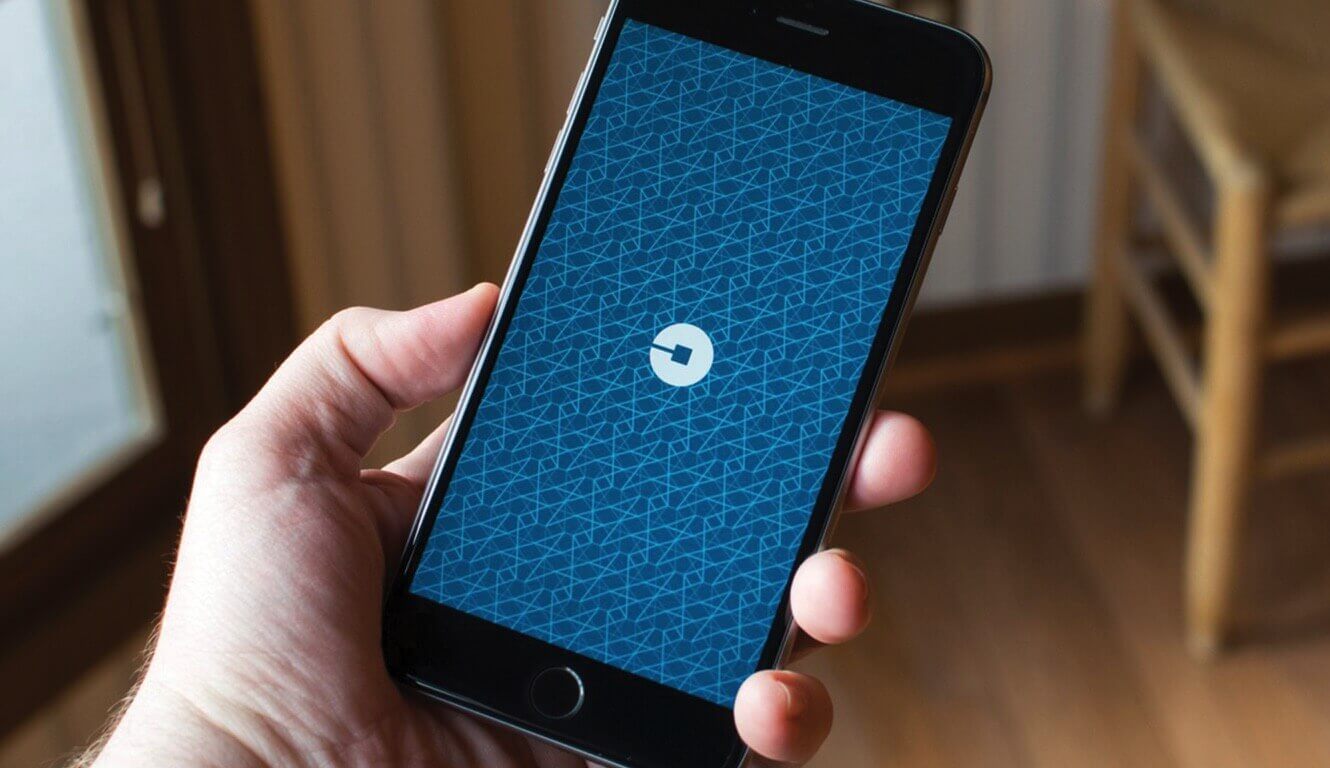
The new Uber identity. Whether you like it or not, it’s impressive.
Brand-wise though, I’ve got a couple of thoughts: The brand is Uber. And the iconic U was its memorable shorthand. (Also useful just in case the other three letters didn’t fit).
In my mind, their brand stands for a revolutionarily simple solution to the not-always-simple challenge of getting somewhere. The technology is imperceptible, yet intriguingly gamified. And the complexity and integration of the organization is seamless, and universally appealing.

Techiniasia.com. Feature image: LinkedIn.comSo does this new brand system reflect this, and create an even stronger sense of desire and affinity for Uber?
Before today, the beauty of the Uber brand was its iconic simplicity and friendly accessibility. The complexity of the new Uber brand feels like it’s trying to express all the intricacies behind the brand. And while it’s true that Uber represents a fine fusion of a modern technological marvel and a powerful human network, but sadly, the new branding misses the whole reason why we love Uber: It gets you there.