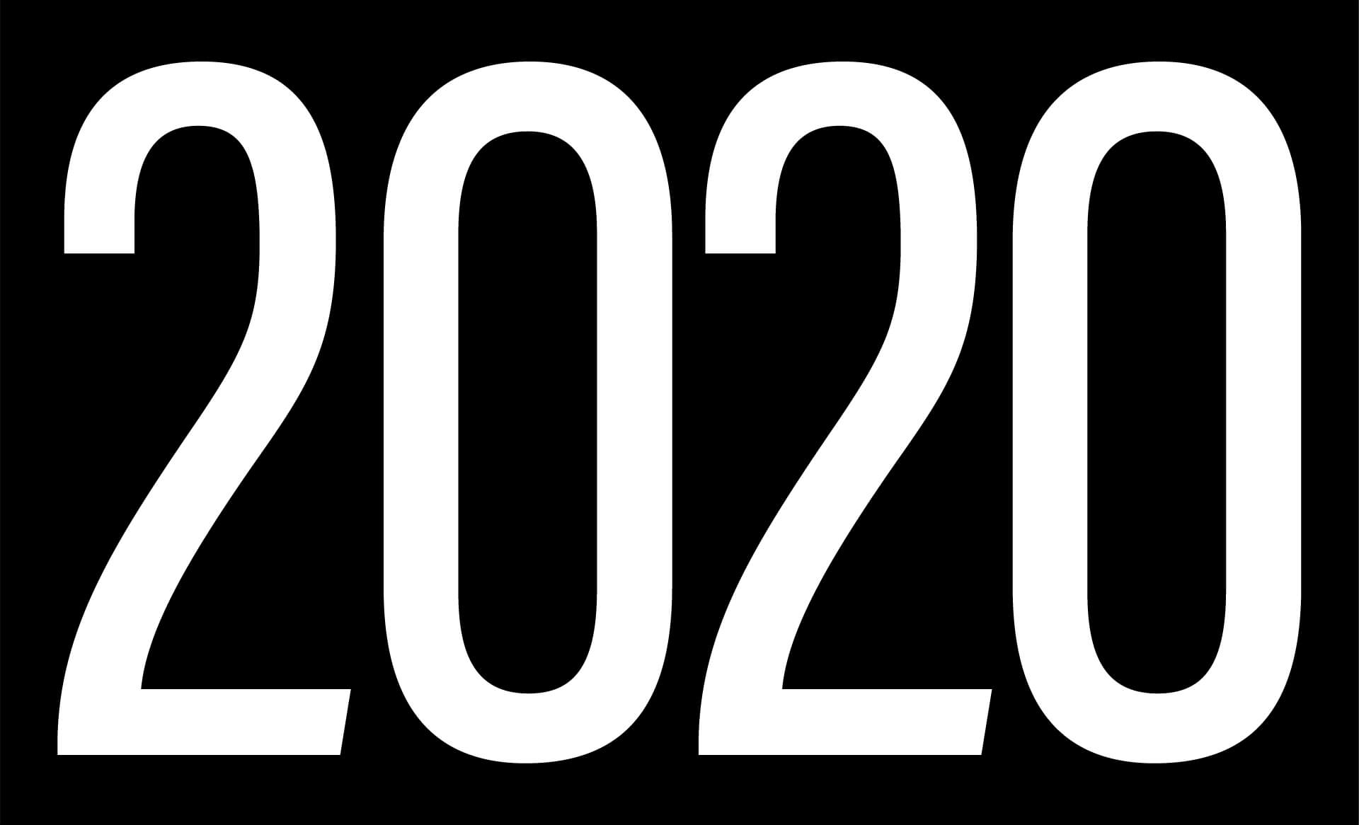
2020 is here, a year that will surely inspire no shortage of sight puns. Appropriate then, that a new year is the perfect time for foresight, tempered by a bit of hindsight.
So for insights about brand and design in the year ahead, I look to the year 2020 itself. Its moment. Its meaning. Even the digits that make it up. Time will tell if these concepts become trends. For now, predictions, guesses, and a couple of wishes.
Minimalism
At this moment, where the perils of excess are at best a nuisance and at worst a global threat, a whole year made from just a “2” and a “0” arrives, and just in time. But will that inspire more use of limited ingredients, of doing more with less? With climate change bearing down, and a mountain of plastic floating in the ocean, I sure hope so. Minimalism is nothing new, but it feels like the right time to double down on doing less. Because in a noisy world, simple stands out.
Repetition
Still, there’s something the year teaches us about when more is more too. You get one “20”, then one more. A great example of the power of repetition. It’s the unsung hero of design, with the ability to increase impact and energy, or provide calm with a sense of familiarity–it can work either way. My guess is we’ll see more designs sporting that 20–20 echo, and I bet they’ll bear repeating.
Symmetry
This repetition also balances the composition: two 20s, side-by-side in harmony. Evenly matched, or depending on how you look at it, evenly divided. Sounds a lot like the situation here in the U.S.—and in many other countries too. In the world of design or just in the world, you might be looking for the beauty in balance. Yeah, let’s see more of that.
Transparency
Now let’s put on our 2020 glasses and talk about seeing better. Trust has been eroded all around us. From idealized lives on social media, to the news we consume, to the propaganda that sneaks somewhere in between, it’s hard to know what to believe.
A potential response? More visibility. More authenticity. More sides of the story. This is where we can lead—both as brand stewards and as designers of the most visible messaging in the world. Plus, I hope to see lots of overlapping color blocks because when transparent colors overlap, they make a third color. Consider it common ground through color theory!
Saturation
2020 isn’t just a new year. It’s the start of a whole new decade. Think about where we were 10 years ago, at the rise of smartphones and social media, and how much we’ve created since. One thing our industry does is produce. At an ever increasing pace. More content, more apps, more brands. More everything. How much do we need, and when will it be too much? More importantly, how do we as creators stand out? And how do we as consumers keep up?
Somewhere in there lies the possibility of a virtuous circle. Consumers demanding, and rewarding, only the best—at any given price point. The extra effort. The extra mile. The extra piece of our hearts.
As creators, we have to rise above the quantity with something unquantifiable. Doing our best work, then making it better. Adding more value. Seizing every opportunity. And when we’ve used as much saturation and intensity as we’ve got, there’s always room to look back at #1. Lighter, softer, calmer hues, anyone?
Welcome to 2020, folks. It’s the perfect time to focus on what matters and always keep the greater purpose in our sights.
Also featured in The Brandberries.
