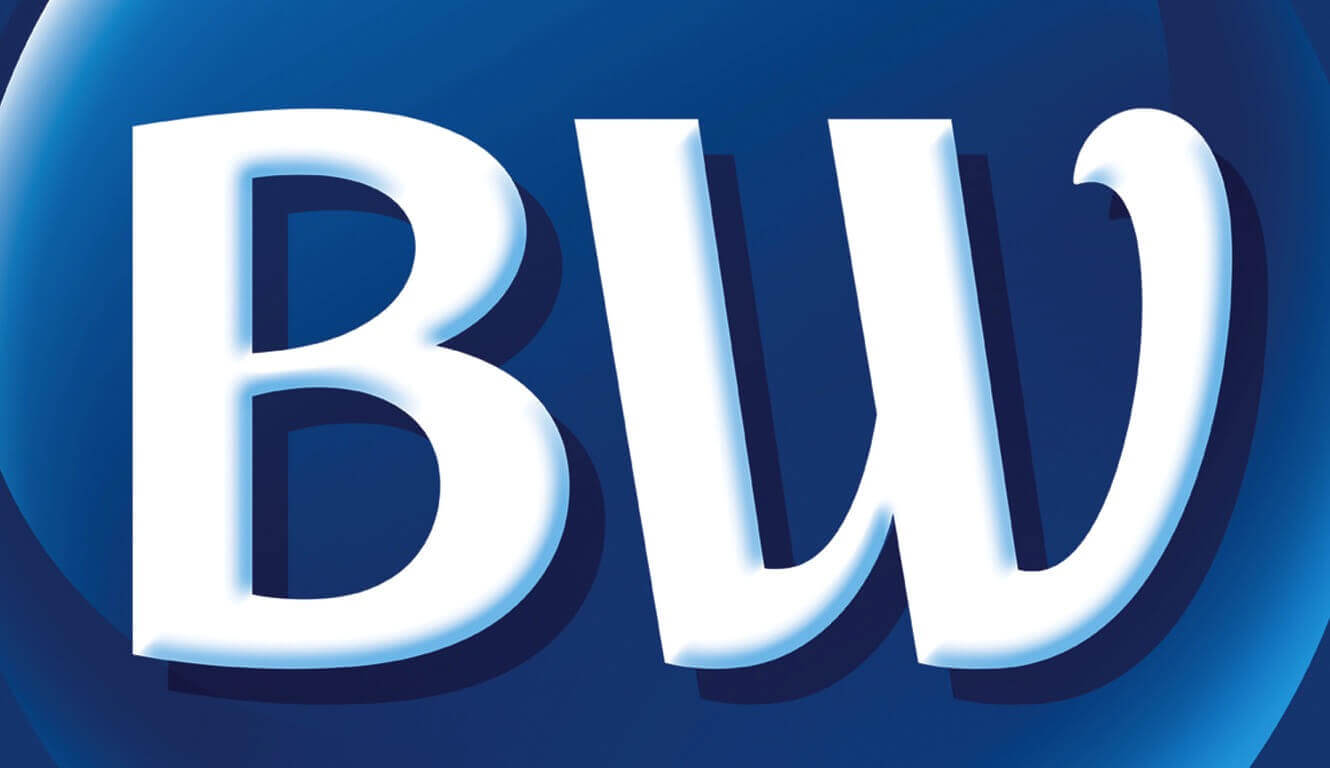
In its 70th year, with the same blue and gold logo it’s had for over two decades, the world’s largest hotel family called for a reboot.
The goal: to broaden the brand’s appeal with a contemporary and iconic identity. We helped the global organization—a network of 4100+ hotels in more than 100 countries—find a new expression that would achieve this modernization and assimilate seamlessly across its diverse global applications. The result was a strategically streamlined master brand logo that carries the hotel’s signature blue hue, with an emphasis on the brand’s initials. A comprehensive identity system strongly differentiates the three brands of hotel properties: Best Western, Best Western PLUS and Best Western Premier.
We’re honored that Best Western included us in the creation of this bold revolution of their brand. While some of the top branding agencies in our industry were unable to get a solution across the finish line, we worked diligently with the team at Best Western to reach their goal. It was a rigorous, strategic and inclusive process, with a keen eye on creating an iconic identity for today’s mobile-centric marketplace. Having built one of the largest and most successful hotel groups in the world, Best Western now has a revitalized brand expression to set the stage for a new generation of world travelers.
Named Top 10 Logo Changes of 2015 by TIME Magazine.

