San Diego Foundation
Nonprofit institution renews its focus on improving lives.
Nonprofit institution renews its focus on improving lives.
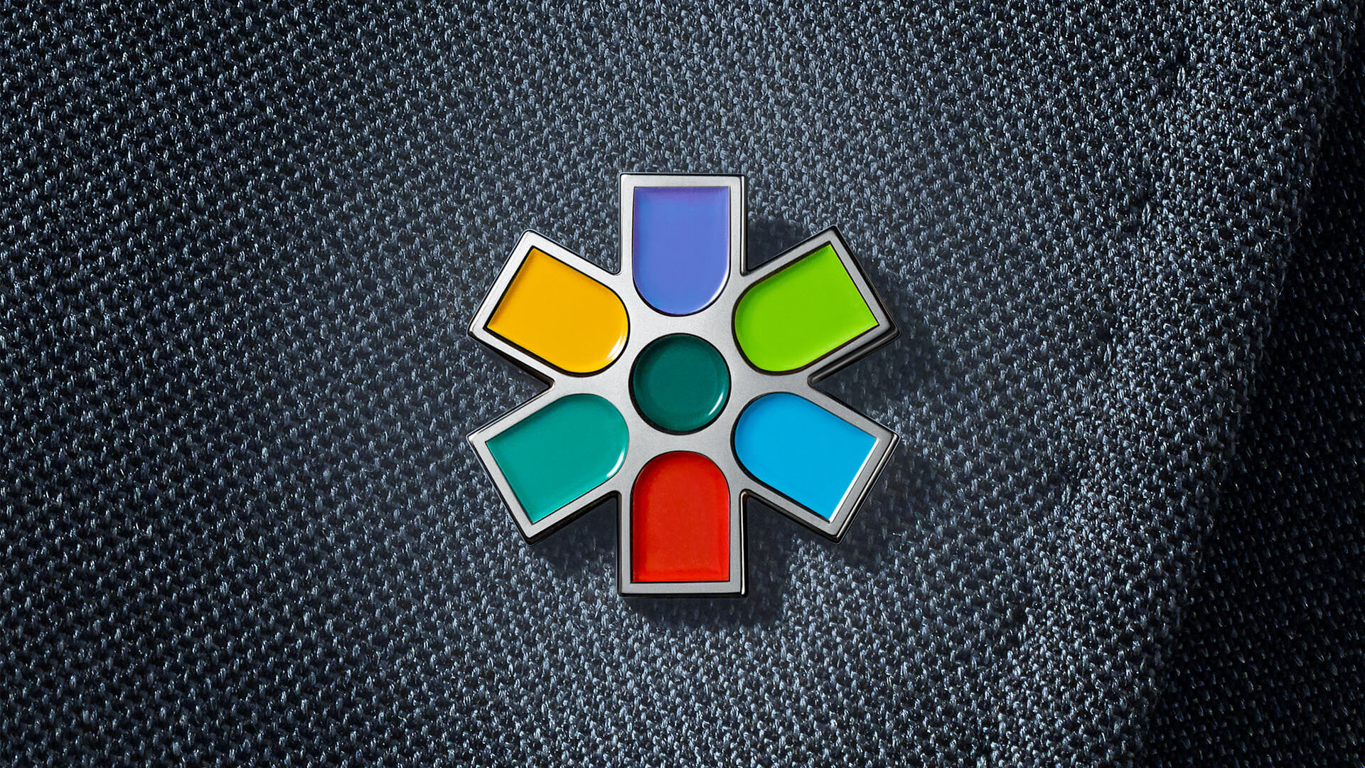
For decades, San Diego Foundation managed a portfolio of donor-advised funds serving the local community. But with new leadership and an expanded mission, the organization took an increasingly active role improving quality of life in the region. A brand identity reset was needed to support the foundation’s transformation.
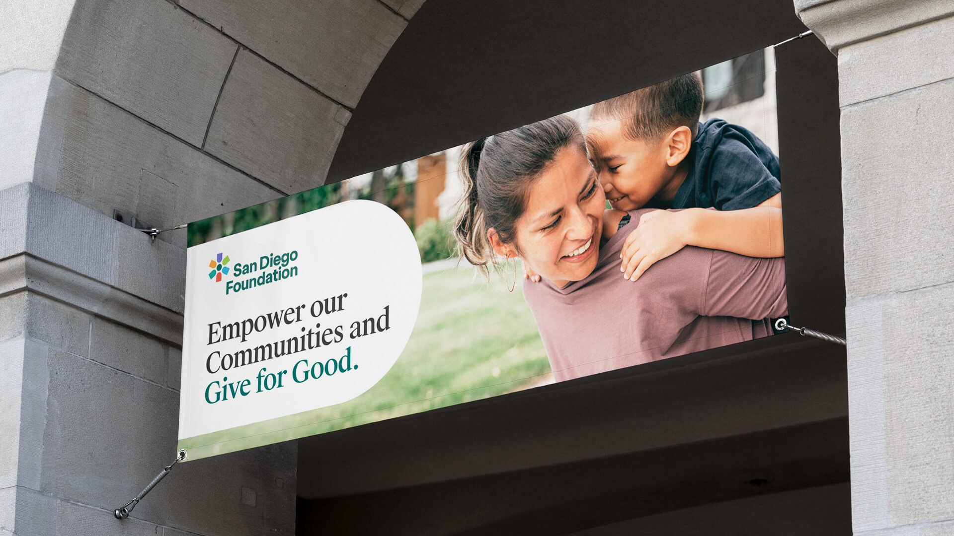
With a multi-color design that suggests diversity and inclusion, the new logo embodies the foundation’s focus on improving the lives of all people in the region. Simple, solid shapes ensure legibility at every touchpoint, while evoking the optimism of a brilliant sun.
In addition to expressing diversity, the brand’s palette maps to its seven focus areas, with each assigned a color for use in communications and navigation.
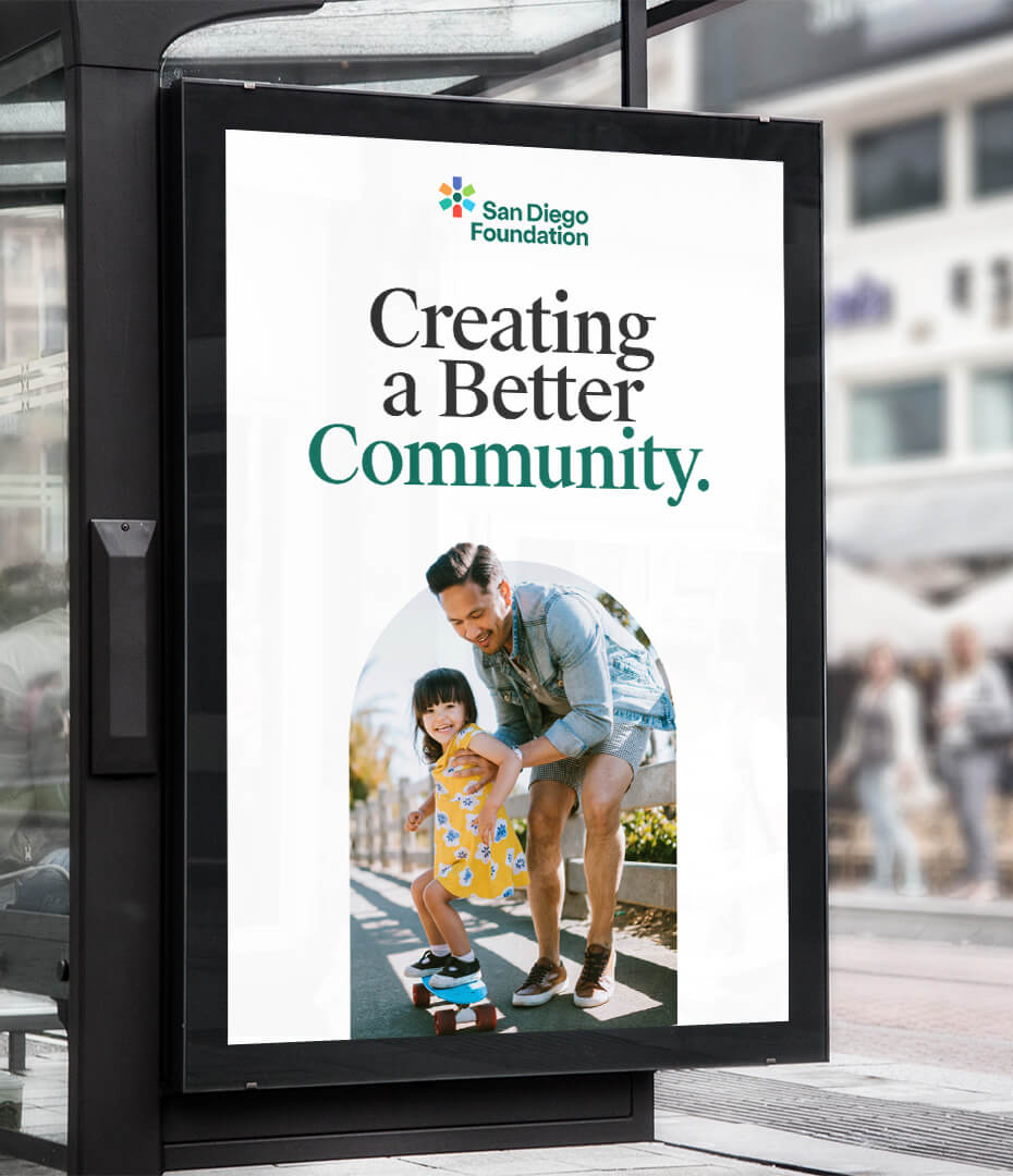
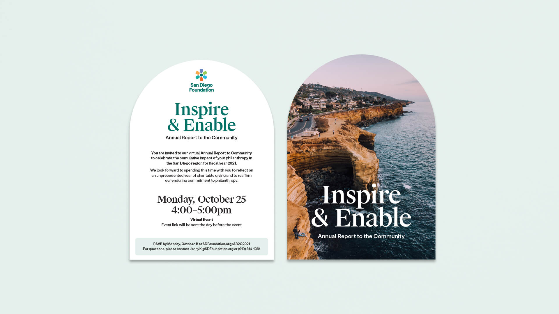
Drawn from the logo, the arched window motif recalls a common San Diego architectural feature—while serving as a useful, unifying brand element.
A collection of icons derived from the logo geometry provides quick reinforcement of core concepts.
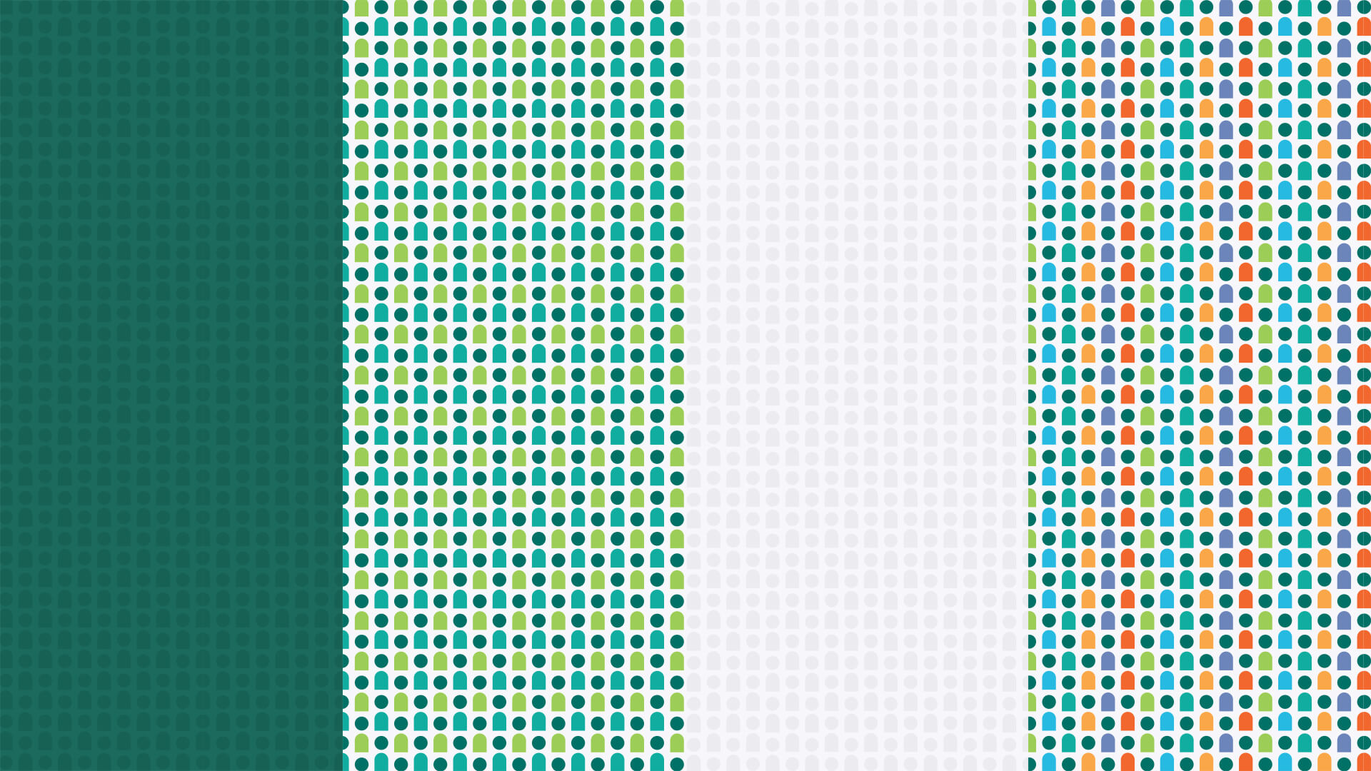
Created from the central human figure in the logo, a repeating pattern reflects the foundation’s commitment to the community.
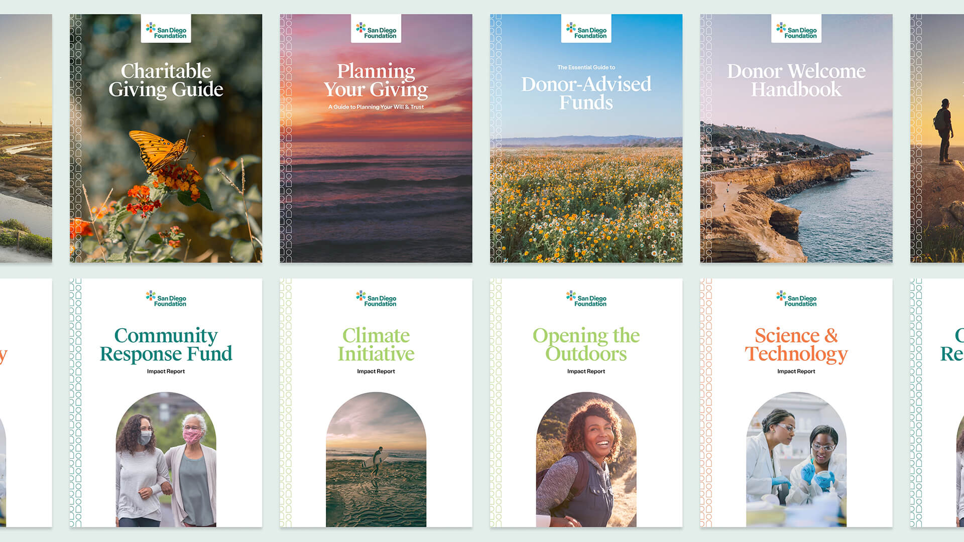
A masterplanned system replaced a patchwork of different styles among the many reports and guidebooks published by the foundation. Incorporating various elements of the identity toolkit, templates are distinct but clearly related.

To help San Diego Foundation earn a place in donor estate planning, a series of TV, radio, and print placements addressed the ultimate question: “What will you leave behind?”
By thoughtfully confronting a delicate topic, the rate of legacy funds opened during the campaign increased by over 4.5X the year-to-date average.
You have my sincere gratitude. The new brand is so uniquely us—who we are, where we are going.
Five years after launch, brand awareness among prospective donors increased by 38%.