Two Roots Brewing Co.
Cannabis and craft beer come together to create a modern brew.
Cannabis and craft beer come together to create a modern brew.

A first-of-its-kind product combining cannabis and craft beer arrives during the green rush of a post-legal market. The groundbreaking brew needed to introduce itself with clarity and modern appeal.
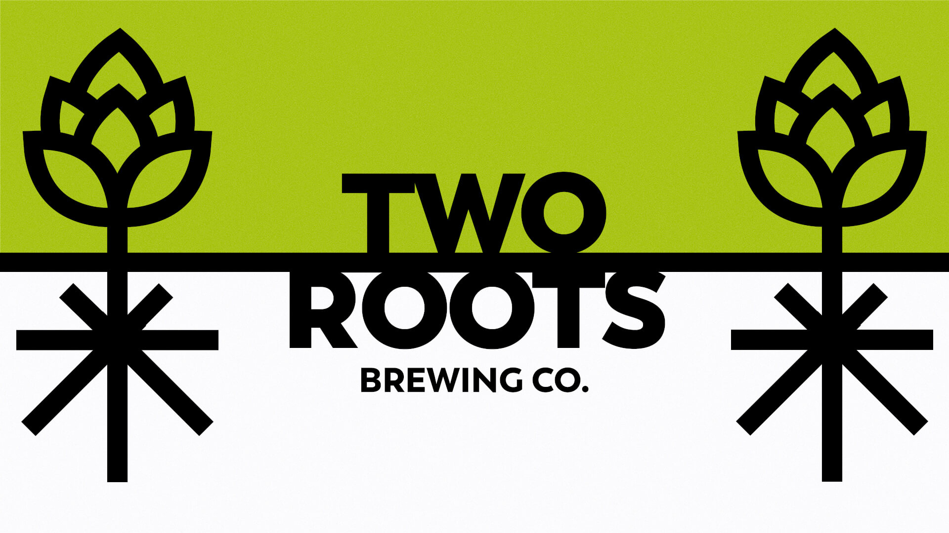
Though the product line features an innovative offering—a beer with active THC ingredients—Two Roots celebrates tradition, as two deep-rooted crafts intersect.
The brand’s bold declaration emphasizes its willingness to experiment with the craft.
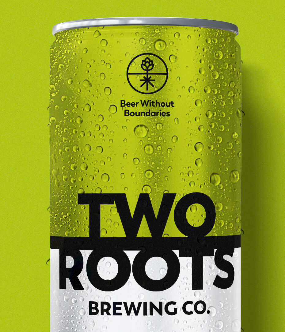
The combination of leaf and hop in a sharp, simple visual reads quickly as the convergence of cannabis and beer to dispensary customers. In mainstream markets, having the leaf double as the roots allows the THC-free version to work equally well.
A dual color strategy works to both maintain the simple, eye-catching appeal of the identity and create separation between products. Green indicates cannabis-infused, gold signals the mainstream non-alcohol version. Each beer style gets its own unique color tab.
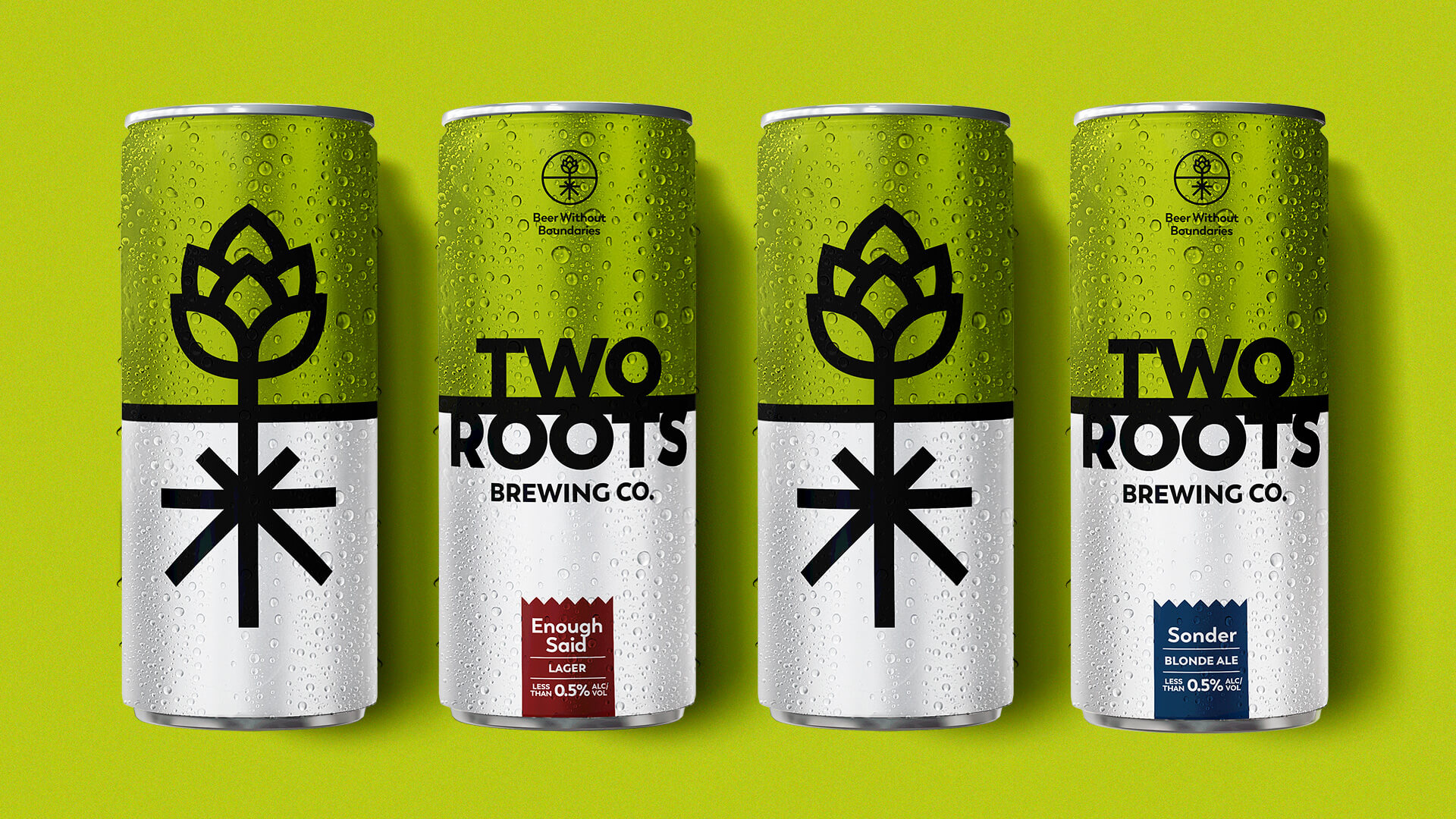
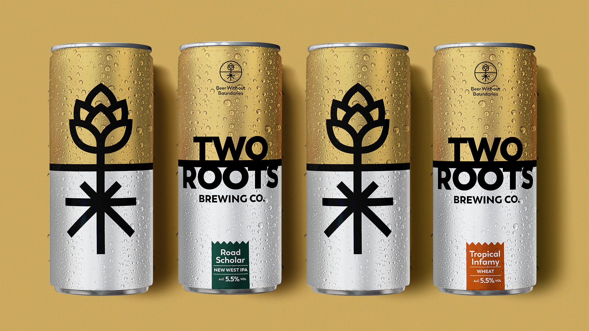
Cannabis-infused beverages featured in 50+ dispensaries across California and Nevada, with additional distribution of non-alcohol beers in 145+ BevMo! stores.