Why branding an art museum requires balancing multiple design priorities.
How might the visual identity for a cultural institution frame the work it features without overshadowing it? How do you create an edgy and fresh brand while also building recognition?
These are the central questions of the conversation “Seeing ICA: From Vision to Visual Identity,” where John Ball, Principal and Creative Director of MiresBall, and Brent Foster Jones, Strategy and PR Consultant, discuss the creative process behind the brand for the new Institute of Contemporary Art, San Diego.
See the process unfold, from defining the vision and developing the visual identity to bringing it all together to tell the story and highlight San Diego as an arts destination.
This conversation was presented at San Diego Design Week. Edits to the following transcription were made for the sake of brevity or clarity.
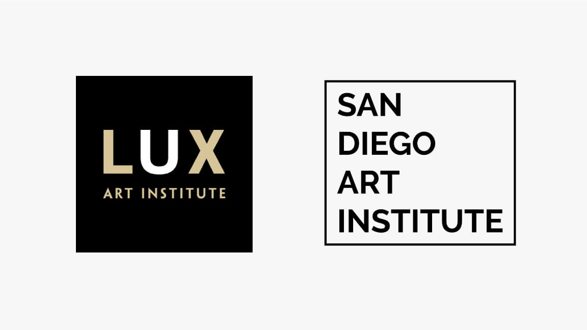
Merging the visual identity of two museums: Lux Art Institute and the San Diego Art Institute
JOHN BALL: This is a new chapter in the cultural life of San Diego. Lux Art Institute and the San Diego Art Institute have now merged into the Institute of Contemporary Art, San Diego. This is a brand-new organization dedicated to experimental art and learning.
Lux was founded in 1998 by Reesey Shaw with support from local arts philanthropist Ramona Sahm. The location in Encinitas at that time was a vacant hillside full of scrub and native plants.
I worked with Lux those early years, helping with fundraising and awareness building. The work came together with the opening of the Artist Pavilion in 2005 and a Grand Orchid-winning building designed by Renzo Zecchetto.
The opening of the Artist Pavilion launched a series of residencies that now totals over 50 different artists who have come, lived, and worked at Lux. This community represented a wide variety of genres and artists working in all mediums.
Since the opening, we worked on branding and communications to showcase the work and the great things happening at Lux around art, events, education, classes, and some popular summer camps for kids.
We aimed to give a vibrant personality to Lux, one of the hidden gems in in San Diego.
Brent, can you tell us about the San Diego Art Institute?
BRENT FOSTER JONES: The San Diego Art Institute is 80 years old this year. It was originally founded as the San Diego Businessmen’s Art Club in Balboa Park in 1941. More recently, it’s the only cultural institution dedicated entirely to experimental contemporary art.
The organization has evolved over the years, going through several different phases, yet always inviting people in to make art attainable and relevant to people.
A new vision for a new museum: The Institute of Contemporary Art, San Diego
JOHN BALL: The merging of these two organizations, what does that mean? What does this new vision hold in store for us?
BRENT FOSTER JONES: The ICA is the ambitious invention of this merger between the two organizations.
Andrew Ütt is the ICA’s fearless leader. He was a curator and a museum executive who understood that the organization shared very long-standing commitments to regional and international contemporary art.
Andrew, who is bilingual, previously lived and curated exhibits in Latin America.
He shared with the combined board a desire to create an adventurous, warm, welcoming living laboratory: a platform for contemporary art and artists that’s accessible to everyone and that’s representative of the San Diego-Baja region’s multicultural population.
There’s such a rich history and current culture of art and activism in the LatinX community, and we want to take advantage of the dynamic energy at the San Diego-Tijuana border and be a showcase and a platform for that.
In that sense, the ICA is proudly binational.
Historically in the United States, ICAs have shared with their public new art, new artists, and new ideas. The first ICA in the United States was created in Boston in 1936. Their idea was a laboratory open to the public where very innovative approaches to art could be championed.
Today, there’s more than a dozen ICAs in the United States that identify new artists and encourage appreciation of contemporary culture, particularly in California.
Andrew and his board and staff want to bring the public in. This is a place where we can gather and ask questions.
The Institute of Contemporary Art, San Diego, presents experimental art and learning with a mission to question everything.
We talk about this idea of questioning literally everything, and when you think about what we have been through over the last year and a half, many people feel as if every assumption should be challenged, everything questioned.
The design brief was dynamic in the sense that while the ICA aspires to be a place that is inviting and welcoming, it’s also a place where one’s ideas could be challenged.
It’s thought-provoking, and there’s an edginess or riskiness when you walk into one of the exhibitions or installations on either campus.
How can branding support a cultural institution’s mission to “question everything?”
JOHN BALL: The ICA has an ambitious challenge. There is a strong ethos to question everything. At the same time, Andrew and the board put out strong pragmatic goals.
They put forward a five-year goal to be recognized by one in 50 people in San Diego County, and to be perceived by seven out of 10 of those who know us as “edgy and fresh.”
You might say those two goals are working against each other. Recognition is the product of repetition and consistency. That works against being seen as edgy, fresh, and always changing.
How do we find a balance between those two? Clearly, if we leaned in any one direction or the other, we wouldn’t achieve all the goals. It was an interesting design challenge before us.
BRENT FOSTER JONES: What was the process to convey this visually and dimensionally? You’re not just talking about print or graphic design, but also wayfinding and signage.
Design concept one: Breaking out of the box
JOHN BALL: When you have lots of objectives and challenges to solve, you have to start somewhere.
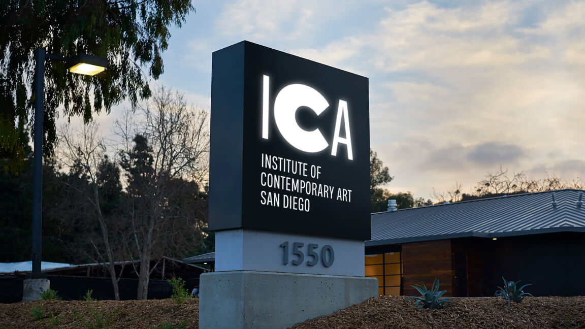
We started in a place that picked up where the two organizations left off. Two organizations that both referenced a square as part of their identity at different times. It made sense to take that square and then bring it forward to the new ICA.
However, we didn’t want to stay within that square. We looked at how the type could extend out of the square. How can we break out of the box literally?
That required us to approach the typography a certain way. We needed the “I” to be from a monospace font to get that extension on both sides of the box.
Within that, we felt like that square motif could do a lot for us: frame visuals and frame artwork. We can connect the squares together at the corners and spread them all over the place. It becomes almost like a confetti or a celebration with these squares in that bright and vibrant green.
That was an interesting and fun place to start. The simplicity and the consistency of that logo element could be a strong visual to help us achieve the goal of being seen and recognized by people.
Design concept two: Democratizing the visual identity
At the same time, that “Question Everything” is ringing in our heads.
If you question everything, then you might question if we need a constant logo or particular typeface. What if we change everything, or change almost everything? What might that be?
We came to this idea that ICA could be anything. It could be any typeface that anybody wants to choose. A very democratic idea that whoever’s at the computer that day and wants to pick a typeface, it’s all fair game. The only structure to this is the consistent use of that bright sky-blue color.
This was an adventurous and challenging way to approach the design challenge. It would be dynamic and always changing, so it hit the objective of being edgy and fresh.
However, the concern with this approach is that it’s not enough of a fixed object to create the recognition we want. We didn’t want to look like we’re some pop-up exhibition or something that isn’t permanent.
BRENT FOSTER JONES: That logo on the hat is great. I’m a child of the 80s, so it made me think of Atari and Pac-Man.
JOHN BALL: That’s the other fun thing about this approach. Typography can communicate so much in simple letterforms, and can take you in so many directions.
And that was ultimately the challenge with this one. We didn’t want to set up a system that caused you to overthink the choice too much. We were concerned that we were putting so much weight on the font choice, that it would become paralyzing in some way.
We loved the spirit and adventurousness of this, but we also began to question the ultimate practicality of it.
Design concept three: No logo is the logo
We kept going down the path to find the right answer for ICA—with “Question Everything” continually popping up in our conversations.
Another question was, “Do we even need a logo?”
This took us to this idea that maybe no logo is the logo. We created an intentional placeholder where the museum logo might be, but it’s not there. The absence of a logo becomes the logo.
Again, a thought-provoking idea that is interesting for those who work in brand design. How might that play out? There was a lot we could do there, with visual elements to tie this together.
Our concern was that this might start to steal the show. We don’t want to get in the way of the ICA’s actual work, programming, and content, but support it.
Final design concept: What do you see?
BRENT FOSTER JONES: How did you get from that to this incredible place that you’ve landed? This whole idea of the “C” that we’re all obsessed with right now?
JOHN BALL: We recognized that the “C” in ICA was all about seeing things:
“ICA _____.” Fill in the blank.
That was the spirit of the organization: That I can see almost anything here.
This was the seed of an idea. That happy circumstance that the “C” can have multiple interpretations or multiple meanings led us into this idea that we can use the “C” as an invitation for people to see something different, or see a new world, or see what you see.
Thinking about all that potential got us excited about the way we can use that “C” as both the visual identity for the cultural institution, and also to start a conversation.
Most great design starts with an idea, and often that idea is a scribble on a piece of paper. In this case, it really spilled out. With that one little starting point, there were so many places that you could take this. So many options.
It was so simple that you could capture the idea right there in a little drawing and see all the potential that it offered.
BRENT FOSTER JONES: Can you talk about how the iterations work together like a family or a system? I love how each of them has their own little nature or personality or character. Yet, they feel like siblings.
JOHN BALL: What’s cool about this identity program is that if offers a lot of tools in the toolbox. They have a different use at different times, so we have levers to move up and down depending on what we’re doing.
This idea that you can use the “C” in a statement to create that dialogue with the audience and yet bring it back to ICA. Then at the same time celebrating the “C.” That changeable, responsive nature of the “C.”
There were so many layers: “C” is the first letter in California, the first letter in community, the first letter in creativity.
As we developed it from that beginning idea, it was a matter of crafting the letters and making that “C” special in the middle. Many designers on our team got involved and created different “Cs.”
It is also an invitation for anyone to draw their “C.” It’s such a simple shape that many things can happen with it.
BRENT FOSTER JONES: What’s wonderful is that there’s really something for everyone.
There’s a notion now in contemporary art that curators and institutions deauthorize themselves, opening the canon and conversation to invite the viewer’s interpretation of art. Whatever you see in a particular work is what you see.
That says something about your own experience in the world. We won’t tell you how to see this. Maybe we’ll tell you a little about the artists and what might be on their minds, but it’s all open for interpretation.
JOHN BALL: We want to be accessible, and at the same time not all people consider themselves to be “artists.” Museums can be seen by some as elite or sophisticated. We wanted to let this be inviting and accessible. A bit fluid rather than stuffy or hard to understand.
BRENT FOSTER JONES: I love what you’re saying because, and I speak for everyone at ICA, MiresBall has captured this sense of fun and dynamism and curiosity. The inquisitive nature of the ICA.
This is a place to come together and have fun, to look at something and say, “Isn’t that funny?” Or contemplate something.
JOHN BALL: We’re not taking ourselves so seriously. Anybody can draw a “C” and interpret it their own way. The identity is flexible.
The basic letter form can get tiny and step into the background to let the art take over, while still giving us the sort of identity and recognition.
Or it can step forward and be exuberant, exciting, fun, and inviting.
We have a lot of dials to turn and levers to move here to make it go up, down, and sideways.