Institute of Contemporary Art, San Diego
An ambitious arts organization launches with a full palette.
An ambitious arts organization launches with a full palette.
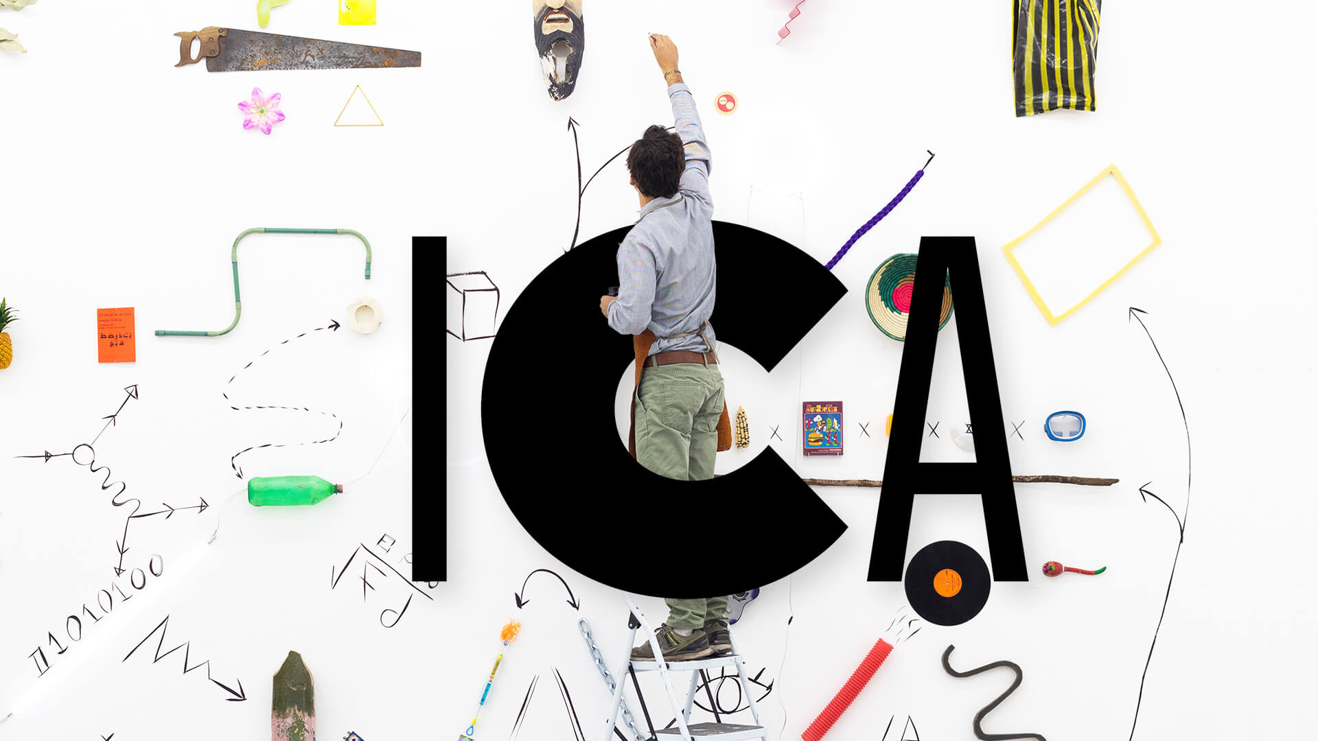
With a courageous mission to present experimental art that questions everything—and equally ambitious goals to bring art to everyone—the ICA San Diego needed a flexible, multi-functional identity that would create instant recognition and invite people into the experience.
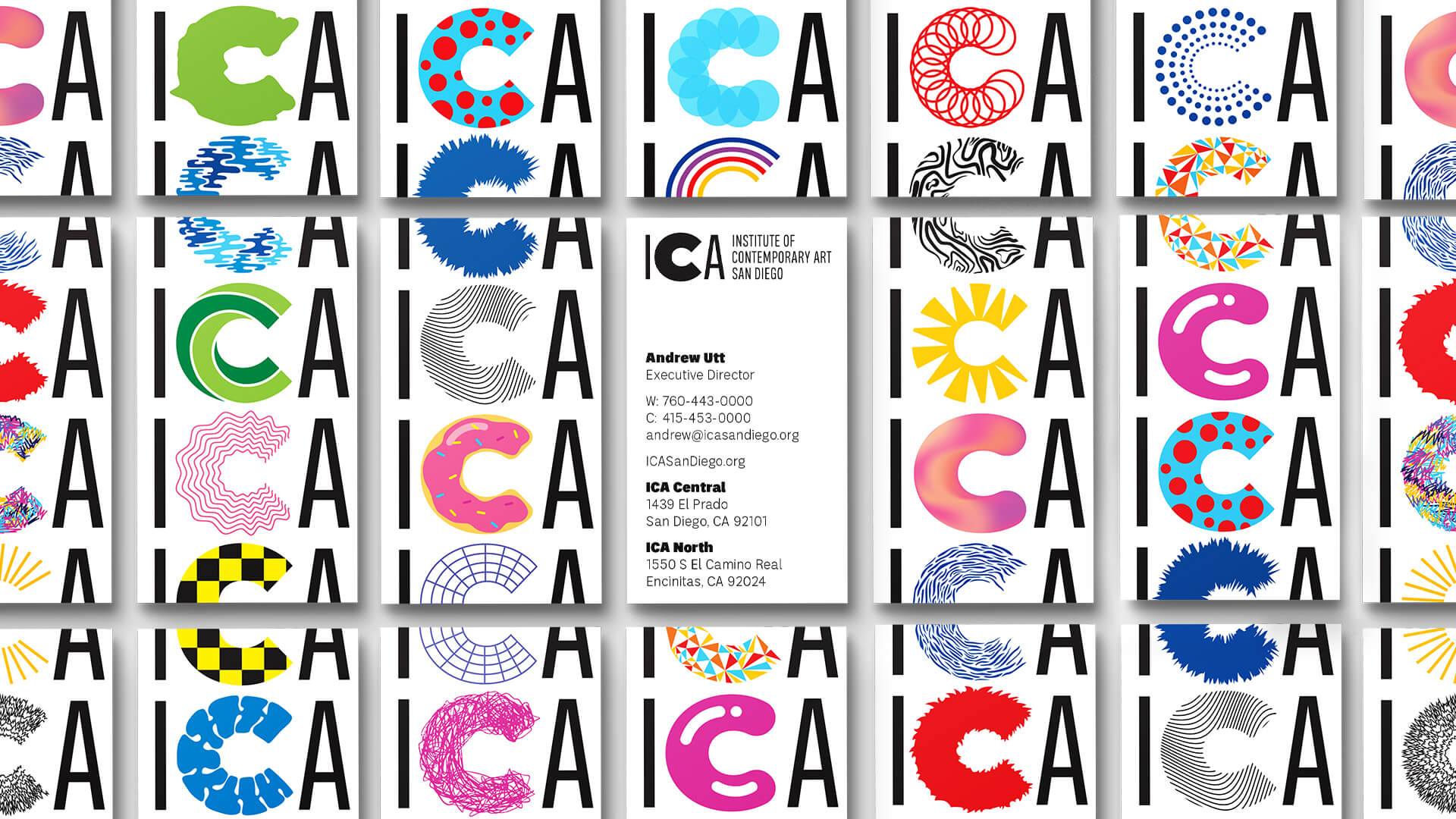
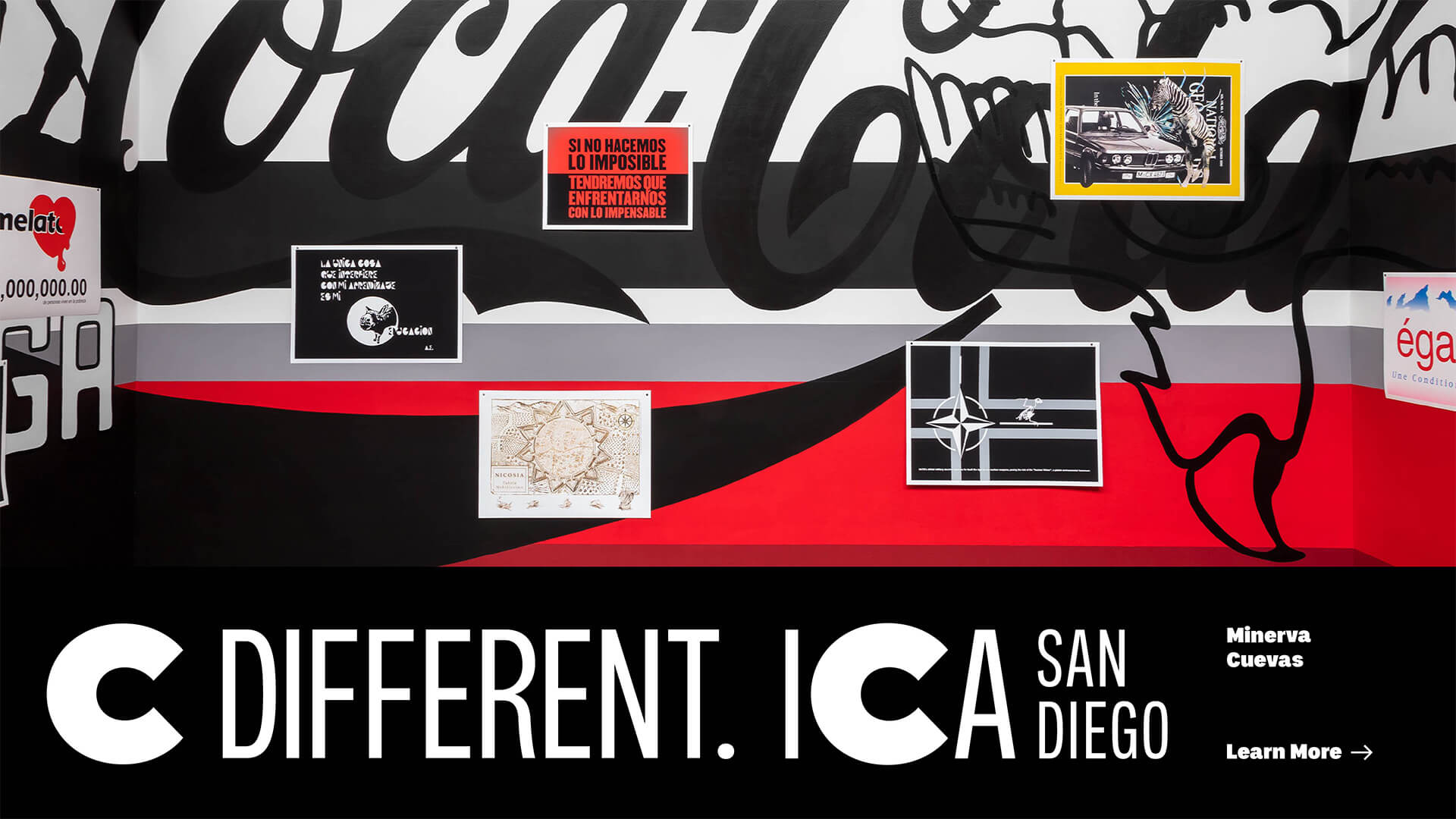
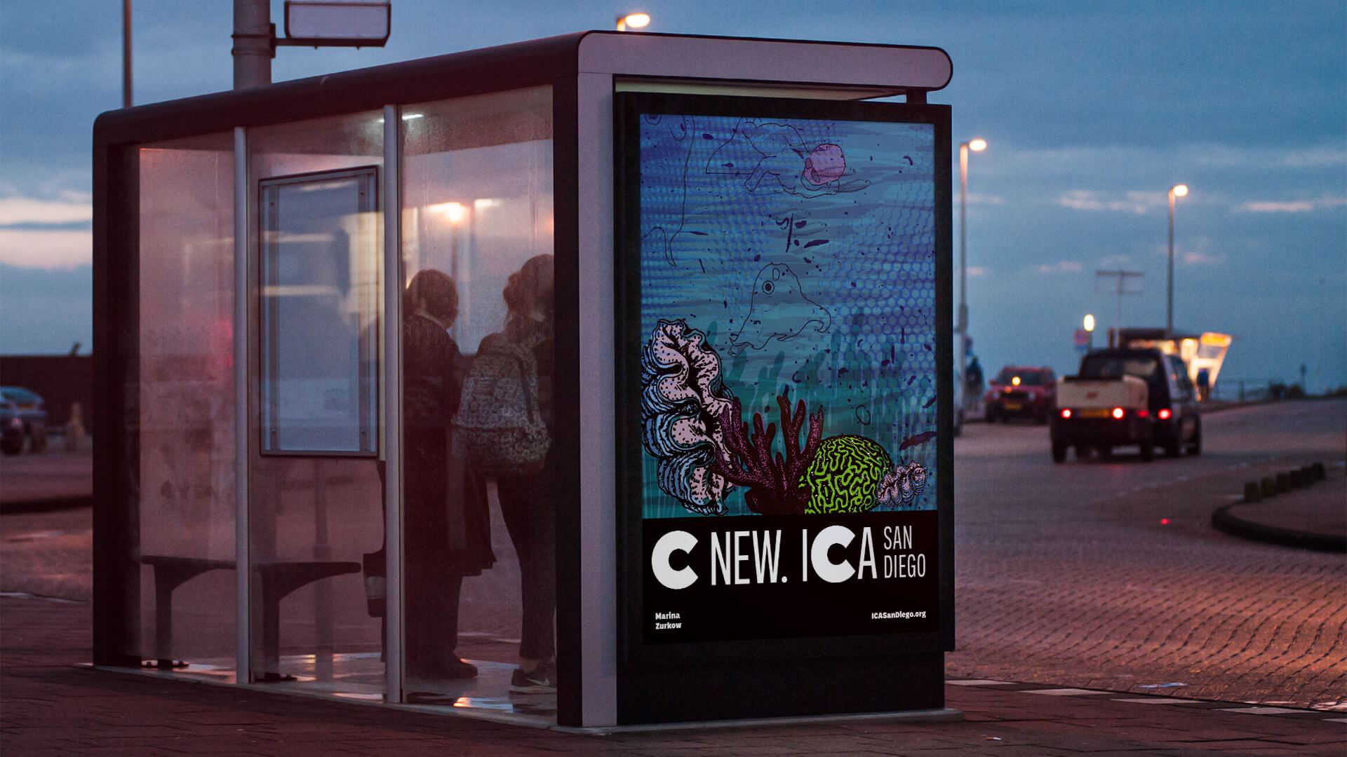
A bold, out-of-proportion C references “Contemporary” within the full name, creating a memorable mark at even the smallest sizes. For more expressive applications, stylized alternate Cs enable the brand to emphasize an ever-changing dynamic.
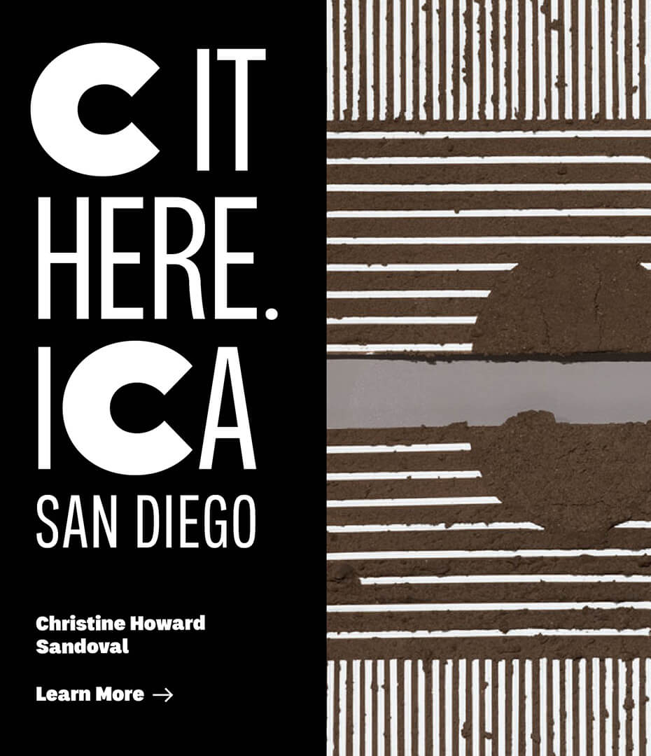
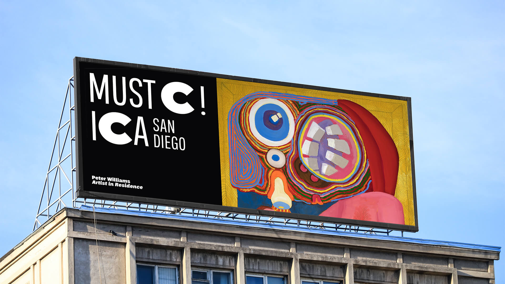
Used in headlines, the bold C becomes a shorthand for “see” that brings the brand into the conversation, reminding everyone there’s always something new to C.

With two locations—ICA Central and ICA North—hosting a full slate of programming, the organization needed to ensure visitors arrive to the right place. A vibrant color system gives each campus a distinct presence throughout the digital experience.
MiresBall has created a strong and recognizable brand identity that can evolve over time, with tools to keep it fresh and interesting.
The new identity toolkit enables a range of different uses, helping the ICA create more impact in more places.