Hydroponic Research
Cannabis nutrient pioneer cultivates its brand to grow.
Cannabis nutrient pioneer cultivates its brand to grow.

With legalization becoming the norm, the cannabis business was becoming more businesslike. It was time to take a game-changing powder nutrient from its DIY roots to the professional field.
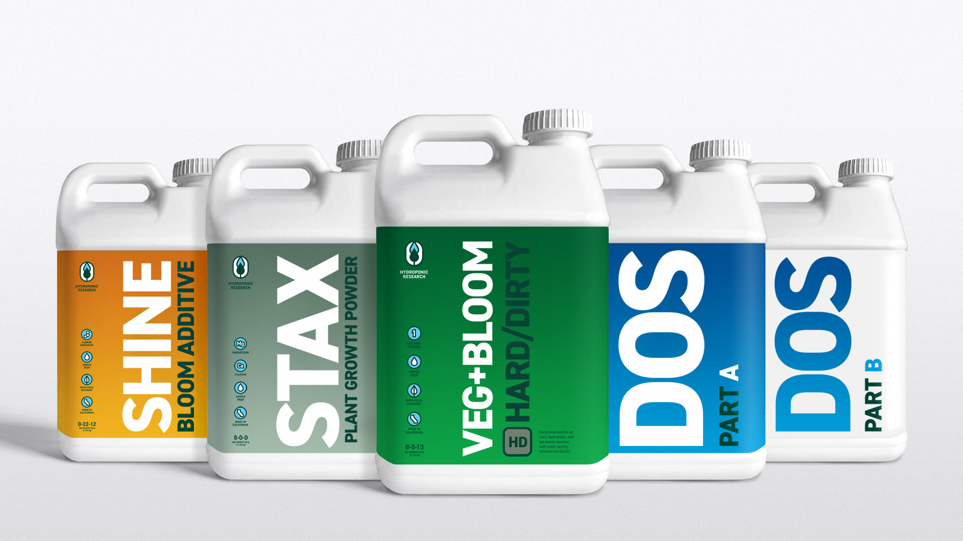
We identified manufacturing mastery as the core strength of the brand, creating a simplified, disciplined visual language that reflects the product purity that growers count on. A less formal voice maintains the homegrown Hydro attitude, letting both customers and employees know it’s still all about the love of the crop.
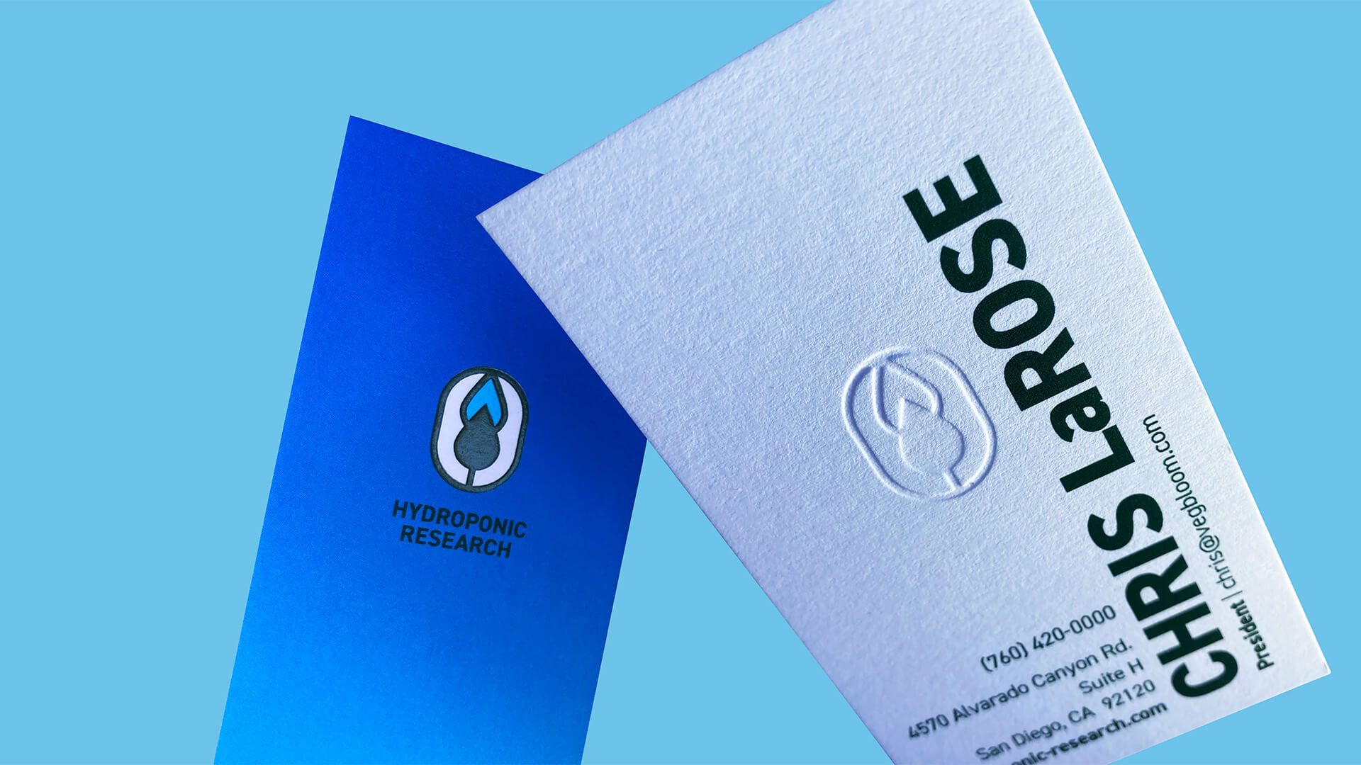
The original logo was replaced with a mark that’s as clean and consistent as the precisely formulated ingredients inside the bottle.


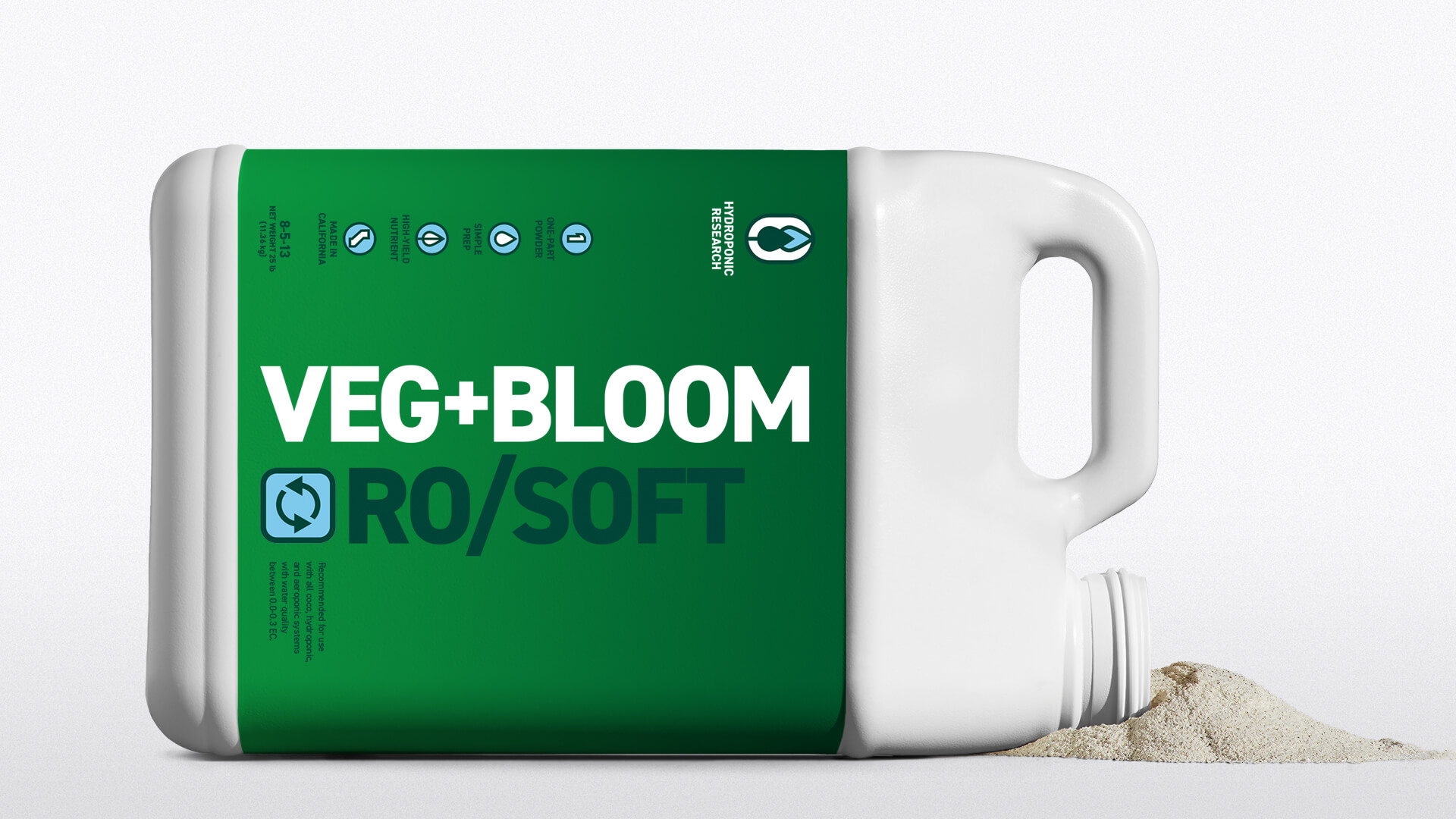
With a product color coding system and bold, vertically-oriented names climbing the label like healthy stalk, growers have an at-a-glance understanding of the nutrients they’re pulling off the shelf.

A strong kit of refined brand elements makes going to market with new messages more focused, consistent, and impactful in an increasingly competitive space.
The overhauled site organized the story and shop into a more functional experience, with added features like a product calculator and grow notes, providing the user with the resources to get the most out of their product.
MiresBall has revolutionized our company’s look and feel, as well as helped to give our essence a solid definition. Working with the crew has been an absolute pleasure, and we look forward to continuing to develop our new look together.
With an online user base that’s grown by 121% in the three months after the new brand and site launched, Hydroponic Research is meeting growers with the nutrients to keep the industry thriving.