PlantKiss
Houseplant nutrient lays the groundwork for growth.
Houseplant nutrient lays the groundwork for growth.

Flanked on either side by well-established mass market names and niche brands, PlantKiss™ needed to connect with a growing crop of millennial and Gen Z consumers. It was time to dig in.

Picking up on the passion of plant parents, the name embodies a nurturing relationship.
A simple but striking expression of the name speaks to the brand’s gregarious personality. Combining upper- and lower-case letters enhances approachability, while increasing legibility.
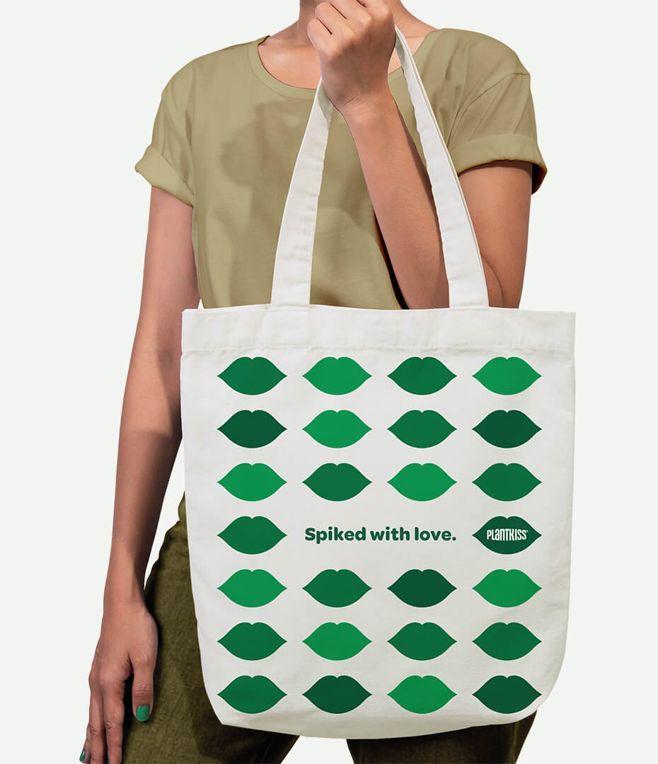
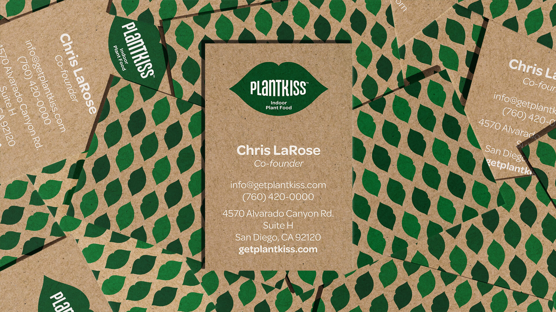
Flexibly fulfilling a range of needs, the brand icon and typography delivers the right amount of PlantKiss presence in every execution.
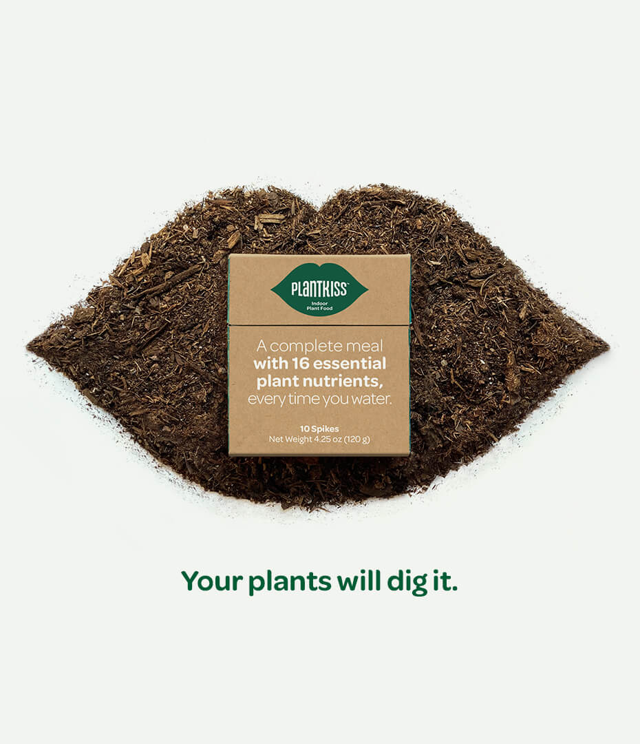


Keeping with its planet-friendly ethos, the fully recyclable package uses minimal material, with a design that makes the most of limited space.
Inspiring purchase of a new product—unlike any other in the category—meant underscoring its simplicity without sacrificing the science behind it.
With an eye on SEO and a goal to gain credibility, the website steps through every aspect of the story with a full measure of PlantKiss personality.
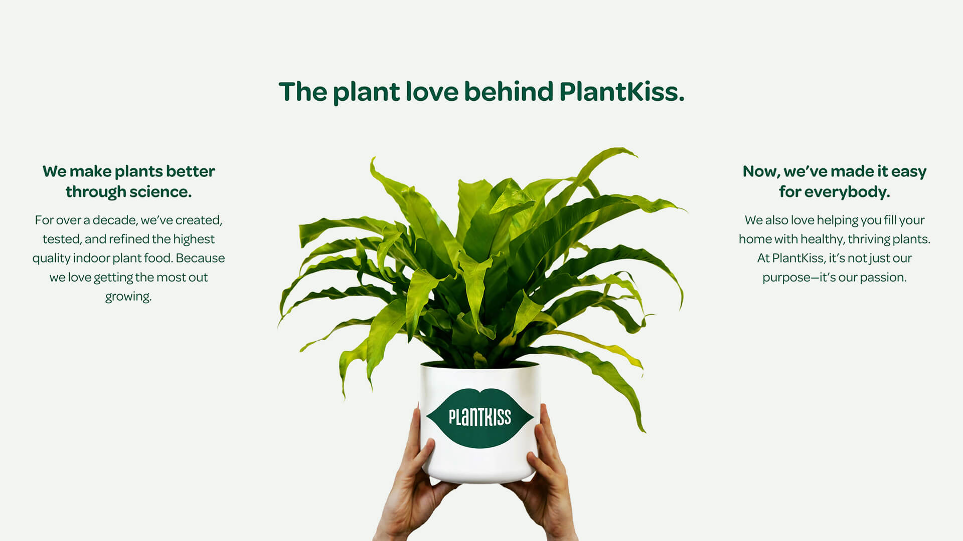
We’re so glad we trusted MiresBall to bring PlantKiss to life. The team captured the spirit of our plant-friendly nutrient and turned it into a name and e-commerce website rich with brand personality.