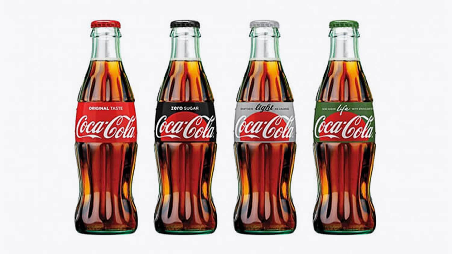
I wanted to Taste the Feeling.
I’m a huge Diet Coke fan, so when I heard Coke was completely redesigning their packaging, I was excited to see what they had up their sleeves.
In the past few years I feel Coke has reset the bar in the soda industry, with innovative packaging that has brought a new level of lifestyle, innovation, creativity, quality and worldliness to the brand.
Great brand design is always grounded in great brand strategy, so it was no surprise that Coke had a bold mission: to express that Coke is truly one unified brand. Their goal was to align all their Coke offerings, create more synergy across their product lineup, reposition the brands to work together, and then advertise them as a single offering.
Wow. I was sure this was going to be good.
And then I saw the packaging. (Insert sad face here.)

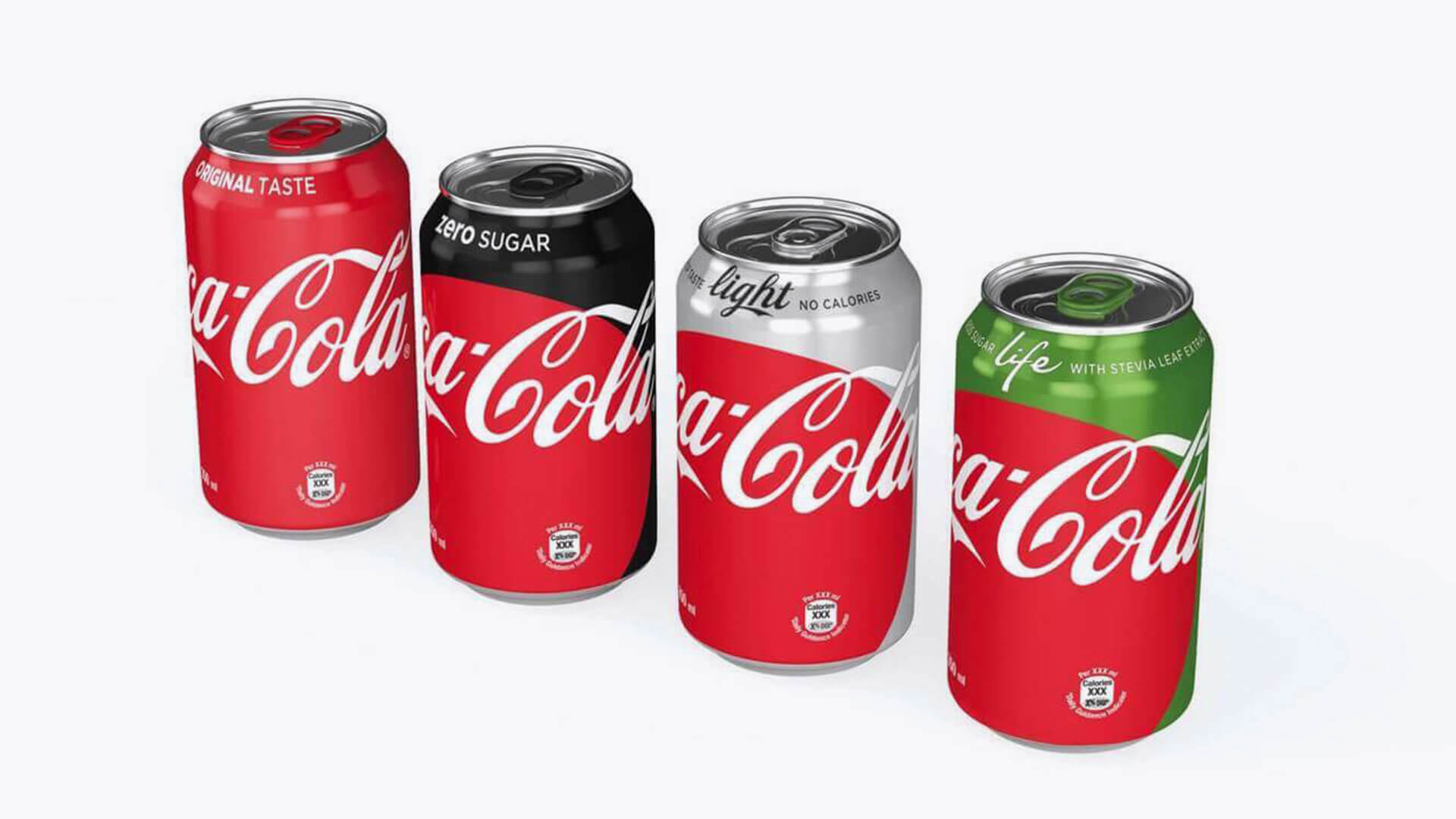
Image courtesy of CocaCola.
While the packaging is good, they missed the opportunity to make it great. It seems that in their efforts to unify their look, they have taken a step back—and lost their mojo. It’s in no way inspired, passionate, or, dare I say, beautiful. Design is more art than science, and it feels like a committee designed this packaging.
I imagine what the fly on the wall at Coke headquarters would have heard:
“We’re known for our red disk. It’s key in our Taste the Feeling campaign, so that’s a mandatory.”
“And our script logo—that’s a must. But maybe it’s too small in the red disk.”
“We need to use our legacy colors from each brand, even though they juxtapose weirdly with the red disk.”
“Let’s just crop the disk. Bigger is good. Oh, look—this is getting great.”
“Hey, for original Coke, let’s just lose the red disk. Yes, that’s nice. And green for Coke Life. We’ll make everyday Christmas!”
“Okay, it’s kinda an eclectic mixed bag of elements, but everyone got their say. Everyone happy?”
Of course, it’s easy to grandstand. I’m just having fun here, because I’ve been in this exact situation. There are, though, a few important takeaways to consider:
If unifying the brand is a goal, each implementation and package should deliver a unified expression. Not a set of disparate pieces.
When expressing a brand with an incredibly organic identity (the beautiful and iconic Coca-Cola script), give that organic element room to breathe. The addition of elements that compete with it will only diminish its presence and “pop.”
Finally, I’ve always loved the idea of tasting the feeling. How might you allow that powerful, emotive idea to come to life in each package? The world knows and loves its Coke; the package should celebrate that. I want to feel that every time my Diet Coke greets me in the fridge. I want to smile after each sip.
Now, I’m a little less smiley.
